Showing posts with label hierarchy. Show all posts

Saturday, July 12, 2014

Type Selection

Every typeface has a distinct personality and the ability to convey different feelings and moods, some more than that. The first and foremost step in selecting a typeface is knowing your goals and the requirements of the project. To focus your design goals and subsequently the most appropriate typefaces to use, start by identifying the age, attention span, and demographics of the audience.
Typefaces have personalities. If their personality do not match the essence of the business or message or text, a conflict can be created which can be distracting. As with selecting any visual theme, typeface choice should be consistent with the content, tone and characteristics of the audience. We can also go with a neutral type of font, that doesn’t have much personality at all.


Researches have shown that non-designers are also aware of the personality of a typefaces even when they do not consciously think about it. 

Thursday, October 18, 2012

Hierarchy - Project

In this project we had to select any one of the Amendment from the Bill of Rights.

The Amendment that i chose was Amendment VI. In lay man's word, Amendment VI simply stated the right that a criminal has once he is in the jail. He has a set of rights which no one can take away from him such as right to be informed of the accusation, right to speedy and public trial and so on.

We had to communicate the same amendment in 3 different ways for a flyer.

In first part - Extreme scale change had to be used
In second part - minimal scale change had to be used
In third part - Image had to be used


In this part, i have used Hierarchy in terms of scale change to emphasize on the important words and phrases that are being told in this amendment. Most important things have been stated in bold and in the highest font size. Following font size tell us about the second important things. This kind of flyer design is most apt for the time when the person does not have time and can just have a hint of the whole amendment for his help.


In this part, minimal scale change had to be used. So in order to achieve hierarchy with minimal scale change i applied the use of different weights of the same font to decide on the most important and the least important information.


In this part, an image had to be used. As this amendment is about the criminal prosecution and the rights that a criminal has while he is in the jail, i decided to use the vector image of prison bars for this. The prison bars are in the center of the page with AMENDMENT VI behind it to suggest that the amendement is for the criminals for help. Also the amendment is written on the prison bars in for anyone to read it. From a distance this flyer will make it obvious for the viewer about the audience for the amendment. 


Out of these three i feel the 3rd one is the most successful because it can be recognized from a distance and it acts as a symbol which people highly recognize. From a distance we can make out the amendment number and also that this amendment is about the criminal rights.

The color that i chose was in accordance with the colors that we associate with law and order. 

Wednesday, October 17, 2012

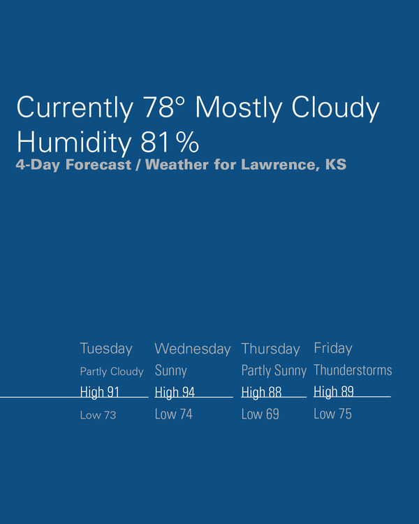
hierarchy in weather forecast...

An example to show how hierarchy is used for Weather forecast....


For more - http://www.behance.net/gallery/Weather-Hierarchy-focused-on-the-Current-Weather/735321

What is Hierarchy

In Graphic Design Hierarchy is the way in which the visual and typographic information is arranged in a design depending on the importance of each element.


An example of Hierarchy in page design.


An example of Hierarchy in packaging.


Example of Hierarchy in Website design