Sunday, October 21, 2012

Scale

Scale is a relative term.
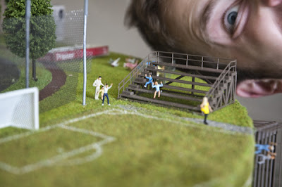
In a composition scale plays an important role in creating depth. The size change among the objects give a feeling of movement in the composition.

One of the basic things in which we use scale largely is the Models we generally make for our school projects!!


Examples of scale in terms of  Photo manipulation


Image

Image is apparently everything in Graphic Design. It plays a very important role in conveying the idea of the concept to the viewer.

Image can be in form of typography, or photography, or illustration, or any other thing that is possible.


Examples in which Typography plays the role of Image.


Examples in which Photography has been used mainly for Image.


Examples in which Illustration has been used for the Image.


Thursday, October 18, 2012

Hierarchy - Project

In this project we had to select any one of the Amendment from the Bill of Rights.

The Amendment that i chose was Amendment VI. In lay man's word, Amendment VI simply stated the right that a criminal has once he is in the jail. He has a set of rights which no one can take away from him such as right to be informed of the accusation, right to speedy and public trial and so on.

We had to communicate the same amendment in 3 different ways for a flyer.

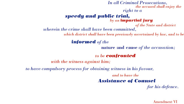
In first part - Extreme scale change had to be used
In second part - minimal scale change had to be used
In third part - Image had to be used


In this part, i have used Hierarchy in terms of scale change to emphasize on the important words and phrases that are being told in this amendment. Most important things have been stated in bold and in the highest font size. Following font size tell us about the second important things. This kind of flyer design is most apt for the time when the person does not have time and can just have a hint of the whole amendment for his help.


In this part, minimal scale change had to be used. So in order to achieve hierarchy with minimal scale change i applied the use of different weights of the same font to decide on the most important and the least important information.


In this part, an image had to be used. As this amendment is about the criminal prosecution and the rights that a criminal has while he is in the jail, i decided to use the vector image of prison bars for this. The prison bars are in the center of the page with AMENDMENT VI behind it to suggest that the amendement is for the criminals for help. Also the amendment is written on the prison bars in for anyone to read it. From a distance this flyer will make it obvious for the viewer about the audience for the amendment. 


Out of these three i feel the 3rd one is the most successful because it can be recognized from a distance and it acts as a symbol which people highly recognize. From a distance we can make out the amendment number and also that this amendment is about the criminal rights.

The color that i chose was in accordance with the colors that we associate with law and order. 

Wednesday, October 17, 2012

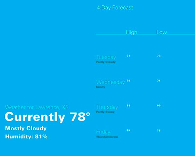
hierarchy in weather forecast...

An example to show how hierarchy is used for Weather forecast....


For more - http://www.behance.net/gallery/Weather-Hierarchy-focused-on-the-Current-Weather/735321

What is Hierarchy

In Graphic Design Hierarchy is the way in which the visual and typographic information is arranged in a design depending on the importance of each element.


An example of Hierarchy in page design.


An example of Hierarchy in packaging.


Example of Hierarchy in Website design


Friday, October 12, 2012

Project - Voice

In this project we had to select a corner and design typographically a message that needs to go in the corner.

The corner that i chose for this is one of the corner of my apartment. 
One side of the corner leads to the room of Computer Science students, who are always indulged into coding and do not like when disturbed.
The other side of the corner leads to rooms of the other roommates who need to know that they should not disturb the gals in the other room.
Keeping in mind the point that there are two different audience in this corner and the messaga has to be given to tow different people in tow different ways, i started with the designing of the message.


The message was : "DO NOT DISTURB CODING IN PROGRESS"


The first part of the message is for the girls who live down the hallway and should not disturb the other girls staying in the room.


The second part of the message was just a reminder for the girls in the room that they have a certain work to do.  


For first part i used a light weight font and had a lot pf spacing between the letter. This was done because though this was a message that has to be adhered to, it was also a message that is in the interior of the apartment. So keeping in mind that point it has to be made subtle and not loud.

For second part, bold letters were used with the pattern that reminds the viewer of coding. It has been put as a wallpaper  because it is the work that they do and have to do in fact. 

Tone of voice

The tone of voice is different for each brand. 
You can’t create a strong and effective user experience without language. And tone of voice plays a big role in this by doing the following:

  • Differentiating you from competitors,
  • Showing your personality,
  • Helping you gain and retain customers.

An excellent example of Tone of voice for the same message in different ways:


The tone of voice here was true to the spirit of the festival, making it authentic, and it was noticeable in other signage, making it consistent. It suited the personality of the festival and appealed to the audience that attended. The tone wasn’t negative (“Please turn your phone off”), which is the approach most commonly taken by cinemas, theaters and airlines. Instead, you were asked turn your phone back on after the talk, on the assumption that you had already turned it off. The bonus of asking you to share news of the session encouraged further positive behavior.
Given the nature of the event, the tone could have been complemented with more personality in the visuals. Something like:


For details about this research please visit : http://uxdesign.smashingmagazine.com/2012/08/21/finding-tone-voice/


Voice examples

Project:
Queensland Art Gallery (QAG),
Gallery of Modern Art (GOMA) rebrand

Studio:

Interbrand Melbourne/Sydney – standapart.com.au

Client:

Queensland Art Gallery – qag.qld.gov.au
Gallery of Modern Art


The concept - The creative concept that came out of that was yin and yang – it’s about recognising that you need balance. It’s not trying to make them the same, but it’s actually celebrating the differences between them. 


For more details please visit - http://desktopmag.com.au/features/project-qaggoma/

Monday, October 1, 2012

Sol LeWitt - Structures

Sol LeWitt  is also regarded as the founder of Minimal and Conceptual Art. His work ranges mainly from his 2D wall drawings to its extension to structures in form of geometric shapes, towers, pyramids and progressions.
He liked calling his sculptures as "Structures". This term he used for describing all of his 3-dimensional works. For his structures, he basically used the basic shapes such as cube. His structures were mostly modular. His designs began with heavy wooden blocks which were heavily hand lacquered. Later it came up to open cubes, which became the basic building clocks for his majority of 3D work.

Sol LleWitt is closely identified with geometric and rectilinear forms. It was during mid 1990's, his forms began to loosen up.

One of his work in structures:


 Splotch #22, 2007
 Acrylic on fiberglass
 ca. 148 x 96 x 86 inches 
 Virginia Museum of Fine Arts, Richmond


  Sol LeWitt died during its fabrication. It is the largest and most complex of these pieces.

Another work of his :

Four-Sided Pyramid, first installation 1997, fabricated 1999

Sol LeWitt used lines, geometric solids, ratio, patterns, formulas, and permutations to create his modern structures and wall paintings. 

Rhythm Project

This project is based on creating an accordion book with the accidental imagery which we find.


In this book i have tried to create a rhythmic concept with  the placement of the text. I have tried to create a flow in text by arranging the text from top to bottom and again from bottom to top as it goes through the pages. The black background on cover and back is done to distinguish it from the spreads.

The found imagery was a challenge to create a story and form a book. choosing 10 correct pieces out of  hundreds of the pieces was interesting and also gave me the sense of story building through imagery. The combining of the images with each other and along with the background and typography was nice and interesting.

There was not much of the found typography in my imagery., except for one. In that imagery i tried to use the found typography as a graphic element rather than a word, because of which it did not affect my own typography. The balance of font size was limited to important words being highlighted. This helped in creating a clutter free overall hierarchy.

I did use the grid in this layout to arrange the imagery that i had. Especially in the paged where more than one imagery has been used, the grid system was used to create a rhythmic balance between the images and the text.